
BeatSpire case study
The mission
Design a top-notch user experience for BeatSpire that nudges free plan users to upgrade to a paid subscription while conveying a unique, edgy, and bold brand identity through color and visuals.
3
Rounds of design iterations


1960s
Pop Art inspiration
A fresh approach
Rebranding and drawing on the counter-culture pop art movement for distinctive colors and imagery, BeatSpire breaks the mold in the music streaming world.

Bold, familiar, and intuitive
A music streaming interface that feels like home yet stands out with its modern and fresh approach.
Discover BeatSpire
Take a closer look at this concept project and the decisions behind the design.
Design objectives
Get to know the audience being designed for
Create branding that is simultaneously familiar and fresh
Design to appeal to the target audience while satisfying business requirements
Test the design and make improvements utilizing the feedback received from users
Getting to know the audience
Through literature analysis, I gained knowledge on the importance of reaching critical mass quickly and creating a fun, social app. A comparative analysis of industry giants inspired ideas to make BeatSpire stand out, while feeling familiar.
After conversation mining on music forums, I understood the audience's wants, needs, and communication style. This guided the development of BeatSpire's brand imagery and voice, establishing an emotional connection with users.
The discovery and research phase ensured the final product was visually appealing and aligned with the target audience's expectations. The research provided valuable insights into industry trends, allowing for a distinctive and innovative approach to music streaming.

Creating fresh and familiar branding
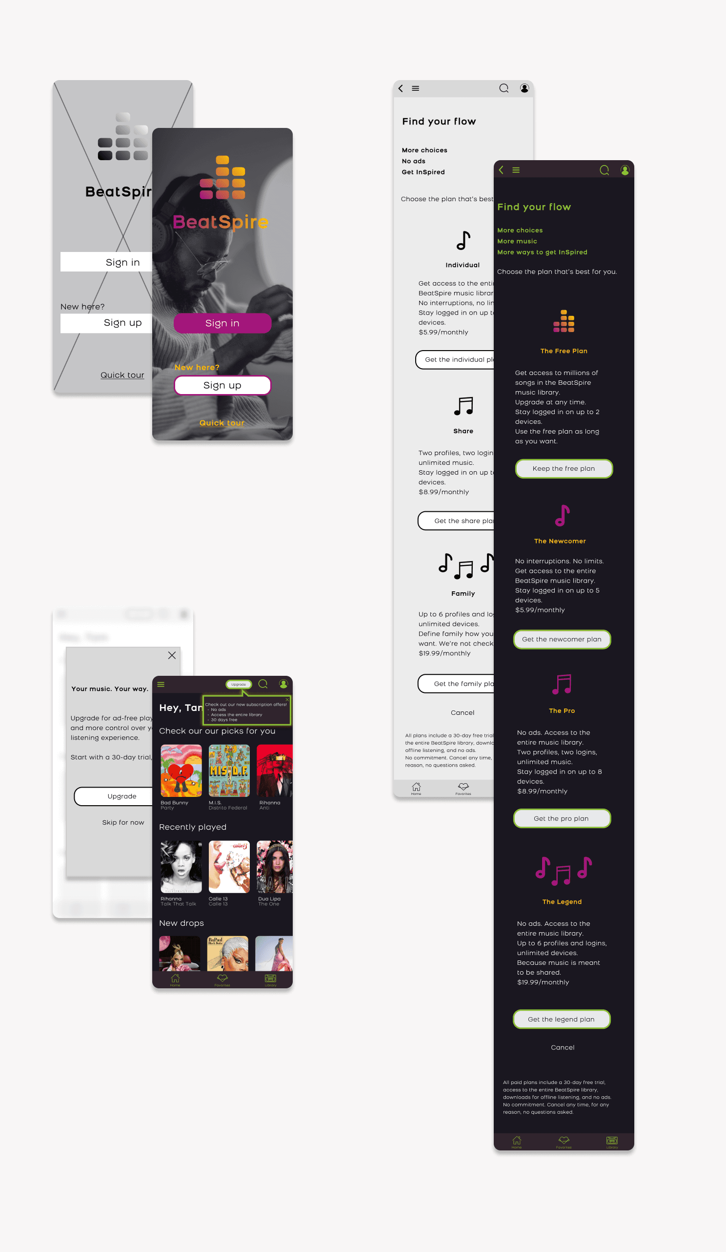
BeatSpire targets young adults seeking bold, smart, and hip music. Inspired by graffiti and pop art, I crafted a color scheme reflecting the edgy spirit of the brand. Bright and contrasting colors, combined with the Bronova font, evoke an energetic and modern feel.
The name "BeatSpire" captures the brand's essence, fusing "beats" and "inspire" while conjuring cityscapes and aspirations. Memorable and catchy, it aligns with the bold and inspiring personality of the brand.
Typography plays a vital role in the branding strategy. The chosen Bronova font perfectly embodies the brand, with strong and geometric shapes in regular and bold weights, complementing the color scheme and infusing a contemporary touch.
This cohesive combination of bold colors, dynamic typography, and an engaging name distinguishes BeatSpire in a crowded market, leaving a lasting impression.


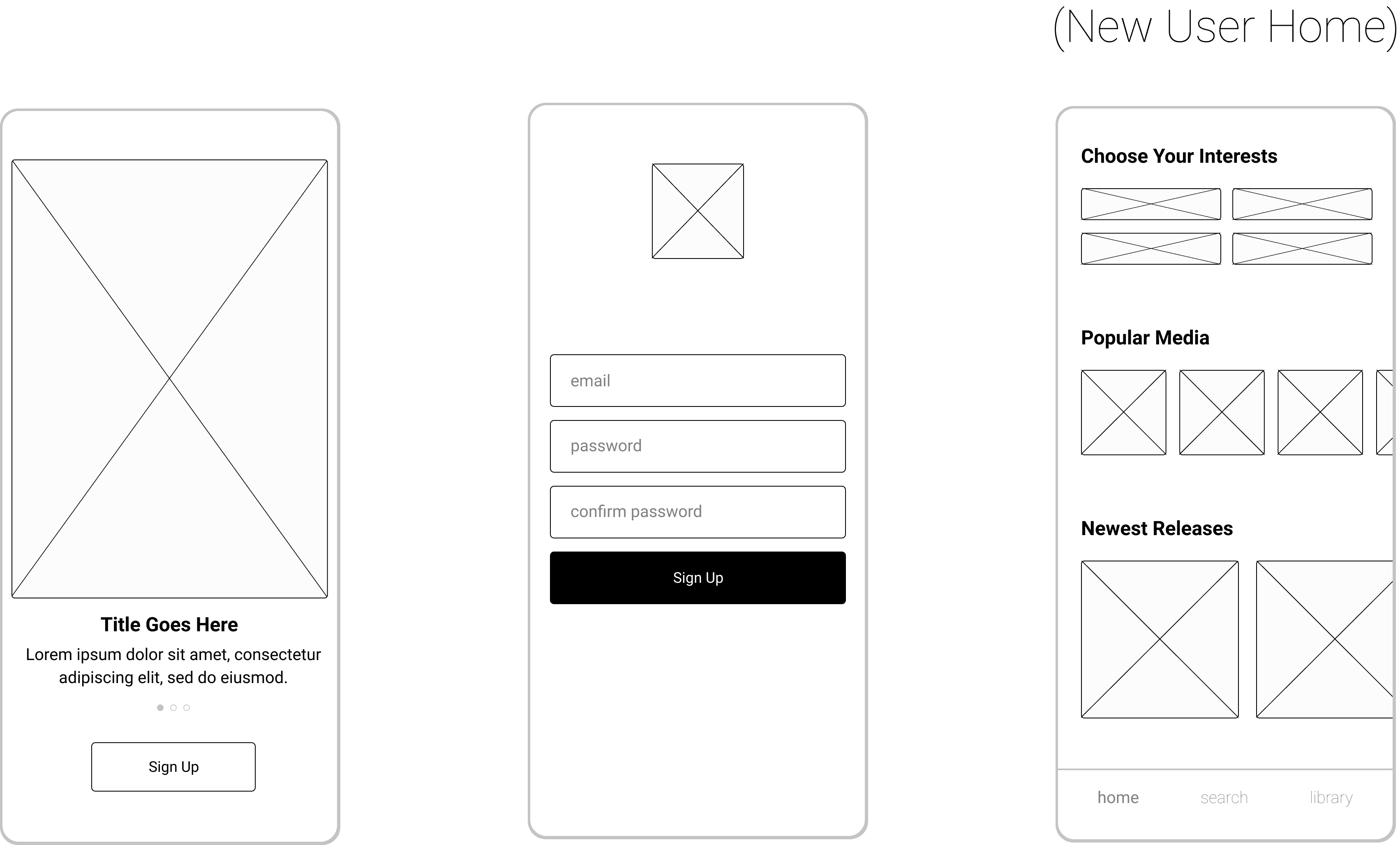
Designing for users and stakeholders
In designing the registration and sign-in flows for the music streaming app, I prioritized user needs and product goals. By incorporating clear calls to action and emphasizing the value of the premium experience, I encouraged users to subscribe and boosted company revenue. Taking a human-centered design approach, I created a streamlined and intuitive flow that prioritizes user discovery and subscription. Emphasizing unique features and benefits, I made the paid experience more compelling. By keeping users at the forefront, I ensured a seamless and enjoyable app experience that exceeds expectations.

Test and improve
Through two rounds of testing with 9 participants aged 18-34, improvements were made to the design based on synthesized feedback. Users relied on imagery and color instead of text, preferences for information order were noted, and excitement was observed when reading about streaming capabilities. Content was adjusted to address text interpretation differences.
Navigation and layout were intuitive, instilling confidence in testers. Attention to small details, such as color and icons, added uniqueness to the app.
Testers expressed enthusiasm for the design's color palette and styling, finding delight in the neon colors, dark background, and unique icons. These reactions highlighted the importance of visually striking design that leaves a lasting impression.
The final design was refined to create a strong emotional impact on the target audience.
Project takeaways and next steps
In the next iterations of BeatSpire, the emphasis will be on improving social engagement by introducing music sharing features and social elements. One such feature is the 'mixtape' functionality, enabling users to create and send playlists to friends as a thoughtful gesture. Additionally, users will have the ability to share their recently played music or personalized playlists with their connections.
Throughout this project, a delightful challenge was encountered: striking a balance between creating a bold and distinctive design while ensuring it remains user-friendly and easily recognizable.
Click the images below to view more from the project.

Click the image to view screens from the project.
Get in touch
To learn more about this project or discuss anything design related, schedule a chat with me!
You can view more of my work by selecting the 'Next Project' button below, or returning to the Work page.
Chat
Next Project